Map Help
Map
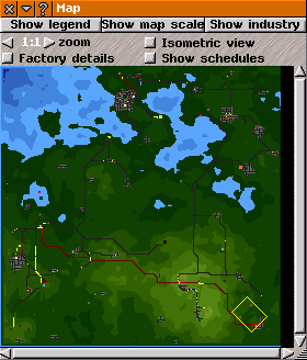
The Map provides a map of the current game world, giving information on terrain, important locations and transport networks. It also provides a way to move the main game window around the world.
Click on the map icon at top of the main game window or press
[m] to open the
Map, which can be
re-sized or minimised. The left/right-arrows on the titlebar, close/open in stages: map options, a coloured scale for some of the options, and a key to the colours of
industries seen on the map.
The map can be zoomed in and out using the "zoom" control: the scale goes from 4:1 to 1:4. If the whole map is not visible then change the map scale, re-size the
Map window, or move the map to see required portion. To move around the map, you can click and drag it (using the right mouse button), or use the slider bars.
On the map, water is blue and lower land is darker than higher land. Shallower water is lighter than deeper water. The part of the game world currently in focus in the main game window is shown by a white square outline in on the map: top of the main game window corresponds to top left side of the white square (North is at the top of the map: North-West is at top of the main game window). If the white square falls off the map, water is seen in the main game window for the corresponding area.
To move the main game window to another place on the map, left click on the point on the map that you would like to be the centre of the main game window. Dragging also works.
If the
factory details checkbox is checked, hovering the mouse cursor over an
industry on the map shows its name, and a white line connecting it to its consumers (if any), which flash. Holding down
[Shift] whilst hovering over an industry will instead show connexions to that industry's suppliers (if any) in red. Those also flash.
On the map (when not using certain legend options):
urban areas, attractions and tunnels, appear light grey; rivers and canals appear blue; bridges appear off-white, roads appear dark grey; railways, and tramways appear dark red; monorail tracks appear orange; narrow gauge and maglev railways appear black; runways and taxiways appear dark yellow;
stops appear light red; and vehicles appear light yellow.
Check the show schedules checkbox to enable a graphical display of a convoy or line's schedule on the map when a schedule is being edited: a light terquoise thin line will link all the points in the currently selected schedule by a straight line.
Check the isometric view checkbox to show the map in the same isometric orientation as the main game window.
Click show map scale to see how various quantitative information (depending on the setting selected in show legend (explained below) is represented in colours in the map. Clicking this button will also show the scale that has been set in tiles per kilometre.
Click show industry to see which colours represent which industries on the map.
Click show legend to see additional options about what is displayed on the map. The following options are available:
Passengers: shows catchment areas for passengers by
stops, colour coded by player;
Mail:shows catchment areas for mail by
stops, colour coded by player;
Freight: shows the quantity of goods and passengers transported on roads, railways, canals, and other ways (use the scale to understand the colours);
Stop status: shows colours to indicate the status of stops in the game, status being how well that the stops are coping with their current traffic level. The colours used here are the same as in the
stop list,
stop information and
line ,anagement windows, and is the same colour displayed in the colour bar above the name of a stop in the main game window);
Service: the quantity of goods, mail and passengers using each
stop (use the scale to understand the colours);
Traffic: shows the level of
vehicle traffic on roads, railways, tramways, canals, rivers and other such ways (use the scale to understand the colours);
Origin: shows the level of mail, goods and passengers that start journey at each
stop (use the scale to understand the colours);
Destination: shows the level of mail, goods and passengers terminating their journeys at each
stop (use the scale to understand the colours);
Waiting: shows the level of mail, goods and passengers waiting for transport at each
stop (use the scale to understand the colours);
Tracks: shows railway, narrow gauge railway and tramway tracks and signals; unelectrified tracks, bridges and tunnels are shown as white; electrified tracks, bridges and tunnels as red, and signals as yellow;
Speed Limit: shows the maximum speed for roads, railways and other such ways (use the scale to understand the colours);
Powerlines: shows
power transmission lines and how much electricity that they are transmitting (use the scale to understand the colours);
Attractions: shows the level of passengers that each tourist attraction generates (use the scale to understand the colours);
Depots: highlights each
depot. Colours indicate the transport type of each depot: shipyards are shown as red; road depots as yellow; railway depots as orange; aircraft hangars as dark orange; narrow gauge railway and magnetic levitation depots as dark blue; and monorail depots as dark red;
Forest: highlights each area of dense woodland in bright green;
Way wear: shows the condition of the ways. (use the scale to understand the colours). Read more about
way wear;
City limits: shows the extent of urban areas; and
Pass. dest.: shows the destinations of passengers and mail produced in a particular urban area. This will show destinations for passengers for the urban area(s) whose information window(s) are currently open. If no information windows are currently open, it will not show any information.
Destinations are shown by coloured dots. The colour of destination dots shows information about passengers and mail:
-
Dark yellow: passengers were able to walk the whole way to their destination.
-
Yellow: a suitable route was found, and the starting stop was not too crowded (equivalent to the happy face in the
stop window).
-
Terquoise: passengers reached the destination by means of their private cars.
-
Orange: there is no available route to the desired destination.
-
Purple: there is a route to the desired destination, but it takes too long for passengers to tolerate.
-
Red: a suitable route was found, but the starting stop was too crowded to be used (equivalent to the unhappy face in the
stop window).